If you’re wondering what to wear for family photos in Melbourne, you’re not alone. Choosing outfits that feel natural, photograph beautifully, and still feel like you can feel surprisingly complicated.
This guide walks through a simple way to coordinate family outfits without matching, the colours that photograph best in Melbourne light, and how to choose clothing that feels comfortable for real families.
Whether your session is at the beach, in a garden, in the bush, or at home, these styling principles help families look cohesive without feeling staged.
Quick answer
- Choose 2–3 neutral base colours
- Add one supporting colour (sage, rust, dusty blue)
- Avoid logos, bright neon, and tight patterns
- Mix textures like linen, denim, and knits
- Coordinate rather than match
In This Guide
- A simple formula for coordinating outfits without matching
- Colour choices that photograph beautifully in Melbourne light
- Texture, movement, pattern, and what to avoid (with the why)
- Outfit ideas for mums, partners, children, and babies
- Melbourne seasons and locations: beach, bush, gardens, and studio
- Final checklist and quick fixes for common worries
If you’re planning a session soon, you can also see examples of my Melbourne family photography sessions here.
A simple formula for coordinating outfits without matching
The easiest way to style a family session is to stop thinking in terms of “outfits” and start thinking in terms of a small, calm colour story — one that keeps the focus on faces and connection.
A method I return to again and again (because it works, and because it’s kind) is what I call the anchor method:
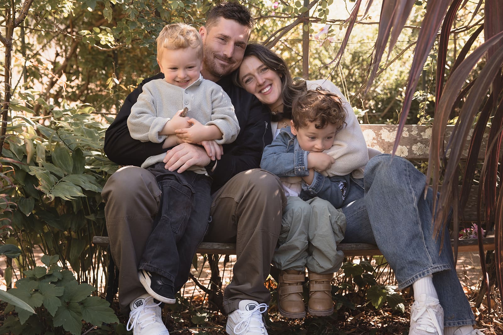
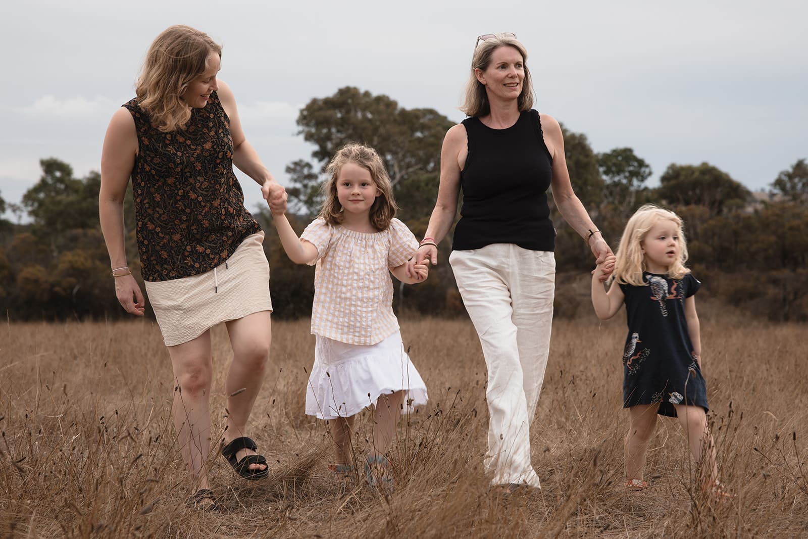
Choose one anchor outfit first (usually mum).
Not because you need to be the centre of attention in an uncomfortable way — but because, in most families, mum is the one doing the emotional labour of getting everyone there. You deserve to feel held by the plan, not burdened by it. This is also the foundation of my personalised styling approach: we start with what supports you, so you don’t have to guess.
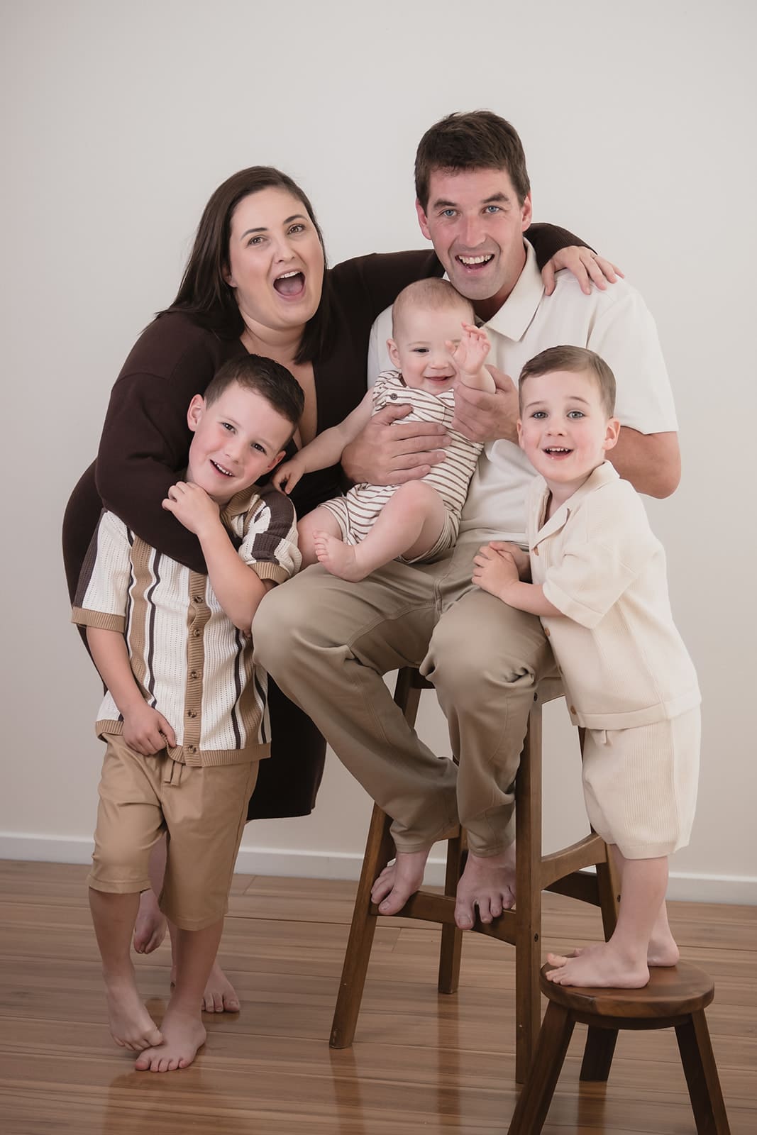
From there, build everyone else around that anchor using a simple palette formula that photographs beautifully:
The safe colour formula (works for most families):
- Two neutrals (your base)
- One to two supporting colours (soft personality)
- One deeper anchor tone (depth + cohesion)
Many families search for family photo colour palette ideas, but the most timeless palettes are usually simple combinations of soft neutrals and one deeper tone. This same structure appears in my “What Photographs Beautifully on You” guidance because it’s reliable and flexible — it creates harmony without making anyone feel like they’re in a uniform.
Example palette (easy and timeless):
Cream + warm taupe (base)
Soft sage (supporting)
Deep olive (anchor)
Once you choose your palette, think of each person as a “variation” of it. Someone might wear the cream, someone the taupe, someone denim with a sage knit, someone olive trousers with a neutral top. It becomes cohesive without looking staged.
A note on “rules”:
A strong outfit plan should feel like clarity — not restriction. If colour theory isn’t your thing (or you simply don’t want another category to learn), you can still get beautiful results using the basic method above. The goal is not perfection. The goal is ease.
What Colours to Wear for Family Photos
Colour is the fastest way to change the feeling of a photograph. It can make an image feel calm and timeless… or busy and visually loud.
It also matters for a very practical reason: cameras respond differently to colour than the human eye. In my styling guide I explain this simply: cameras pick up colour casts and contrast more strongly, and “almost right” colours can look unexpectedly off once you’re photographed.
That doesn’t mean you have to avoid colour. It means you choose colour on purpose.
Why colour can change your skin tone on camera
In photography, colour is not only what you wear — it’s also what your clothing and surroundings reflect back onto your skin.
- Photographer education sources commonly demonstrate that wardrobe can reflect light back onto the face and create unwanted colour casts (a yellow shirt is a classic example), and that outdoor environments can do the same (green from grass, for example).
- Major camera education also teaches that reflected light can significantly change shadows and brightness on the face — which is part of why styling and location work together.
This is why very bright colours (especially saturated or neon tones) can become distracting: they don’t just “sit” in the image — they can throw colour onto the skin and pull attention away from faces.
The Melbourne light factor (what’s different here)
Melbourne sessions often move through mixed light: open shade, pockets of sun, reflective sand at the beach, deep greens in the bush, pale trunks and silver-green leaves in eucalyptus areas. Those changes are part of what makes Melbourne photographs beautiful — and part of why muted, earthy tones work so consistently well here. They don’t fight the environment.
Also: Melbourne weather really can change quickly (sun to wind to rain to cool air in a short window), and local meteorology explains why “change days” happen — warm air from the north meeting cold air from the ocean, with cold fronts moving fast.
This matters because colour behaves differently in different weather and light (bright sun vs heavy cloud), so choosing calmer tones gives you flexibility.
The easiest colour direction for timeless family photos
If you want a gentle, emotive look that will still feel like you in ten years, start here:
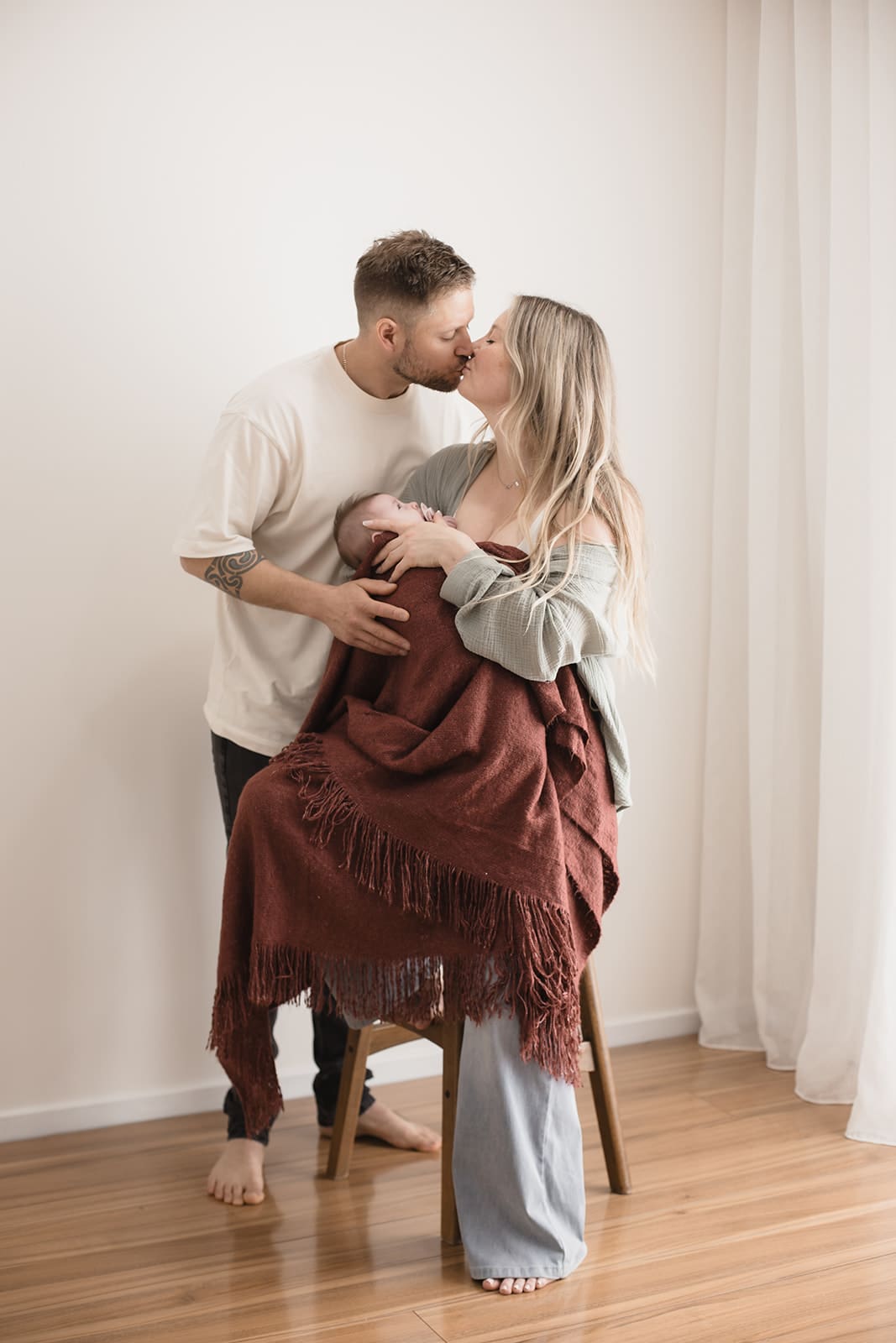
- Cream, oatmeal, warm taupe
- Soft greys (especially in cooler light)
- Olive, sage, eucalyptus
- Dusty blues, soft denim
- Muted clay, soft rust, gentle terracotta
This isn’t about “everyone must wear beige.” It’s about choosing tones that keep the focus on connection.
And if you’re worried neutrals won’t suit you: that’s exactly why I created my free styling resource — What Photographs Beautifully on You — to help you understand which tones support your skin, hair, and eyes without changing who you are.
A quick, tested way to check if a colour will photograph well on you
Stand in natural window light and hold two different tones near your face (for example, warm beige vs soft grey). Notice what happens to your skin and eyes — whether you look clearer and more rested, or whether shadows deepen and redness becomes stronger. This simple check is part of the at-home method I share in my personalised styling guide.
One more helpful truth: sometimes colours “change” depending on the light source. In colour science this is often explained through metamerism — where colours can appear to match under one lighting condition and look different under another.
That’s why it’s worth checking outfits in the same kind of light your session will be in (window light is a good everyday stand-in).
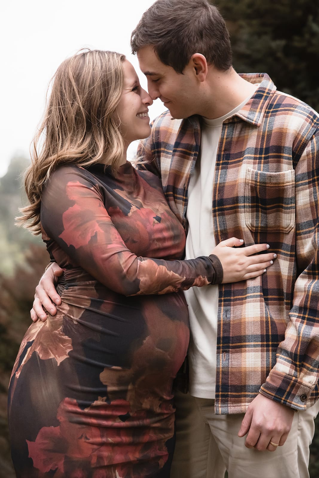
Texture, movement, pattern, and what to avoid (with the why)
If colour sets the mood, texture and movement create depth.
This is one of the biggest differences between photos that feel “alive” and photos that feel flat: movement gives fabric a softness that mirrors real life — walking, cuddling, lifting children, holding hands, sitting down together.
What photographs like depth
Textures that reliably photograph well (especially outdoors and in-home) are textures the camera can “read” without distraction:
- Linen (soft structure, natural creasing, breathes well)
- Knits (adds warmth and dimension)
- Ribbed fabrics (subtle detail without chaos)
- Soft denim (classic, grounded, doesn’t dominate)
- Embroidery or lace used gently (not high-contrast)
You don’t need all of these at once. One or two textured pieces is often enough to add depth.
What can create problems on camera (and what to avoid)
There are three common outfit issues that show up in professional photographs, even when the clothing looks fine in the mirror:
Fine stripes / tight checks / tiny repeating prints
Digital imaging sources clearly explain that finely patterned clothing can create moiré — strange waves or swirls that appear only once photographed. Adobe’s photography education even uses a striped shirt as the example.
This isn’t about aesthetics; it’s about how digital sensors translate fine repeating detail.
Logos, slogans, and big graphics
These date quickly and pull the eye away from faces. They also compete with the emotional tone most families are hoping for.
High-contrast black + white combinations near the face
They can create a harsh tonal jump, and your eye may go to the contrast before it goes to expression. If you love a monochrome look, consider soft charcoal, cream, and gentle layering rather than stark extremes — and if you’re someone who suits strong contrast, do it intentionally.
A gentle note about “avoid” lists
Some portrait education guides use strict “don’t wear this” language, but many photographers now explain the “why” so families can decide what matters most to them.
That’s my approach too.
If your child only wants the Spiderman shirt? We can work with that — but you should know what it will do visually, and then choose with clarity.
Outfit ideas for mums, partners, children, and babies
If you’re searching for family photo outfit ideas in Melbourne, the easiest approach is to start with one anchor outfit and build a soft palette around it. This section is here for the “tell me what to actually wear” moment — but I want to hold it gently: the best outfit is the one you can move in, breathe in, and feel like yourself in.
For mums (including postpartum)
Choose a piece that does three things:
- Feels comfortable for real movement (lifting, sitting, walking, holding)
- Sits softly on the body (doesn’t require constant adjusting)
- Supports your colouring so you feel calmer in the frame
Reliable options:
- Linen dress (midi or maxi) with a cardigan or denim jacket
- Knit dress with soft shape (defined somewhere, relaxed somewhere else)
- Wide-leg trousers with a tucked knit or linen shirt
- A tonal outfit (similar shades head-to-toe) for an effortless, lengthened look
If you don’t want to label your “season” or think about colour analysis at all, the simplified approach in my styling guide still applies: choose soft neutrals over stark ones, avoid neon and icy pastels, and skip colours that make you feel like you need more makeup.
For partners
Partners often want “simple and not fussy.” Perfect.
Aim for:
- Neutral chinos or dark jeans (no heavy distressing)
- Linen or cotton shirt in a soft tone (oatmeal, grey, sage, dusty blue)
- Knit or overshirt layer for depth (especially in cooler months)
If you’re styling two adults, the goal is rarely to match; it’s to belong in the same visual world.
For toddlers and children
With kids, comfort is the plan.
Choose:
- Soft cotton, knits, overalls, simple dresses
- Layers that can come on/off easily
- Colours that won’t show every snack smear (cream is beautiful, but be realistic)
A practical trick: if a child is deeply attached to a character item, consider using it intentionally (for a few frames, or at the end) rather than letting it dominate the entire session. It keeps peace and keeps your gallery cohesive.
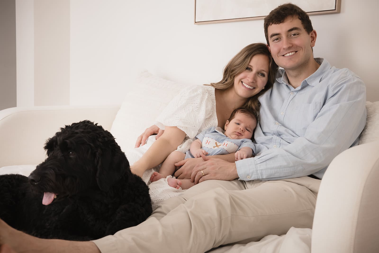
For babies
Keep it simple and soft:
- Neutral onesie or knit romper
- Bare feet (often the sweetest detail)
- Avoid loud prints and bold graphics that pull the eye away from their face
Melbourne seasons and locations: beach, bush, gardens, and studio
Outfits don’t exist in a vacuum. They interact with location and season — and Melbourne gives us a lot of variety.
Beach sessions (Mornington Peninsula, bayside, coastal)
Beaches are bright — sand and water reflect light upwards, and wind adds movement.
What works beautifully:
- Creams, taupes, dusty blues, soft greys
- Textured knits and linen (movement is your friend here)
- Bare feet or simple sandals
- Layers that look good in wind (cardigan, wrap, denim jacket)
What to watch for:
- Very short, stiff dresses that blow up constantly
- Hats that cast heavy shadows across eyes (unless intentionally styled)
Bush / forest / eucalyptus locations
Greens can reflect into skin, and deep shade can feel cooler.
What works beautifully:
- Warm neutrals (oatmeal, camel-leaning tones, warm taupe)
- Olive, rust, muted clay
- Denim, knits, subtle texture
This is also where cohesive palettes matter most — because the environment has strong colour, and outfits that are too bright can fight with it.
Gardens and parklands (soft, romantic, classic Melbourne feel)
Gardens tend to suit:
- Soft florals (one person only, not everyone)
- Dusty rose, muted blues, creams
- Gentle layers and texture
If you’re choosing between a garden look and a beach look, you don’t need a whole new wardrobe — you need a palette shift and the right layers.
Studio sessions (clean, timeless, calm)
In studio, clothing becomes more prominent because backgrounds are often simpler.
That’s where you can lean into:
- Tonal outfits
- Soft texture
- Minimal pattern
- Gentle contrast
And avoid fine stripes even more strongly — because studio lighting and crisp detail can make moiré show up clearly if clothing has tight repeating patterns.
A Melbourne reality: plan for weather shifts
Melbourne’s quick changes aren’t just a saying — the meteorology behind “change days” (fast-moving cool changes and cold fronts) is well documented.
This is why layers are not only practical, they’re also visually helpful: they create depth, and they let you stay comfortable so you can stay present.
If you’re still planning the details of your session, you may also find the other family photography guides and resources helpful. You can also explore locations that photograph beautifully across Melbourne and Victoria in different seasons and light.
Final checklist and quick fixes for common worries
The day-before layout (reduces stress immediately)
Lay out:
- Each full outfit (including shoes)
- Any layers (cardigan, jacket, wrap)
- Simple accessories (if you’re wearing them)
- A backup option for children (and a spare for babies)
If something needs constant adjusting in the mirror, it will distract you in real life. Comfort wins.
What to pack (especially with children)
Bring:
- Wipes and a small towel
- Water + simple snacks
- A neutral backup top for kids
- A comfort item (if needed) that can step in and out of photos
Quick fixes
“We don’t have time to shop.”
Use the anchor method: choose one adult outfit you love, choose two neutrals + one supporting colour, then pull variations from what you already own. This approach is also aligned with my broader styling ethic: no trends, no pressure, no shrinking yourself — just clarity.
“Can we wear bright colours?”
Yes — if brightness is part of your family’s story. But choose one “hero” colour and soften everything else around it, and avoid neon near the face because reflected colour casts are real and difficult to correct perfectly.
“What about patterns?”
One pattern can work beautifully. Multiple competing patterns tend to photograph as noise. And avoid fine stripes/tight checks because moiré can appear unexpectedly on camera.
“I don’t know what suits me anymore.”
That is more common than you think, especially in motherhood. That’s why I created a resource specifically to help you understand what photographs beautifully on you — without changing who you are.